Chapter 33 Spatially Continuous Data II
NOTE: The source files for this book are available with companion package {isdas}. The source files are in Rmarkdown format and packed as templates. These files allow you execute code within the notebook, so that you can work interactively with the notes.
Previously, you learned about the analysis of area data. Starting with this practice, you will be introduced to another type of spatial data: continuous data, also called fields.
33.1 Learning objectives
In the previous practice you were introduced to the concept of fields/spatially continuous data. Three different approaches were discussed that can be used to convert a set of observations of a field at discrete locations into a surface, namely tile-based approaches, inverse distance weighting (IDW), and \(k\)-point means. In this practice, you will learn:
- About intervals of confidence for predictions.
- Using trend surface analysis as an interpolation tool.
- The difference between accuracy and precision in interpolation.
33.2 Suggested readings
- Bailey TC and Gatrell AC (1995) Interactive Spatial Data Analysis, Chapters 5 and 6. Longman: Essex.
- Bivand RS, Pebesma E, and Gomez-Rubio V (2008) Applied Spatial Data Analysis with R, Chapter 8. Springer: New York.
- Brunsdon C and Comber L (2015) An Introduction to R for Spatial Analysis and Mapping, Chapter 6, Sections 6.7 and 6.8. Sage: Los Angeles.
- Isaaks EH and Srivastava RM (1989) An Introduction to Applied Geostatistics, Chapter 4. Oxford University Press: Oxford.
- O’Sullivan D and Unwin D (2010) Geographic Information Analysis, 2nd Edition, Chapters 9 and 10. John Wiley & Sons: New Jersey.
33.3 Preliminaries
As usual, it is good practice to begin with a new session of R or at least to clear the working space to make sure that you do not have extraneous items there when you begin your work. The command in R to clear the workspace is rm (for “remove”), followed by a list of items to be removed. To clear the workspace from all objects, do the following:
Note that ls() lists all objects currently on the workspace.
Load the libraries you will use in this activity:
Begin by loading the data file that we will use in this chapter:
You can verify the contents of the dataframe:
##       ID                  X               Y               V
##  Length:470         Min.   :  8.0   Min.   :  8.0   Min.   :   0.0
##  Class :character   1st Qu.: 51.0   1st Qu.: 80.0   1st Qu.: 182.0
##  Mode  :character   Median : 89.0   Median :139.5   Median : 425.2
##                     Mean   :111.1   Mean   :141.3   Mean   : 435.4
##                     3rd Qu.:170.0   3rd Qu.:208.0   3rd Qu.: 644.4
##                     Max.   :251.0   Max.   :291.0   Max.   :1528.1
##
##        U           T
##  Min.   :   0.00   1: 45
##  1st Qu.:  83.95   2:425
##  Median : 335.00
##  Mean   : 613.27
##  3rd Qu.: 883.20
##  Max.   :5190.10
##  NA's   :195
We have already met this data set before: it contains a set of coordinates X and Y (units are meters; the origin is false), as well as two quantitative variables V and U (notice that there are missing observations in U), and a factor T.
33.4 Uncertainty in the predictions
A common task in the analysis of spatially continuous data is to estimate the value of a variable at a location where it was not measured - or in other words, to spatially interpolate the variable. In Chapter 31, we introduced three methods for spatial interpolation based on a sample of observations.
The three algorithms that was saw before (i.e., Voronoi polygons, IDW, and \(k\)-point means) accomplish the task of providing spatial estimates. The values that we obtain with these methods are called point estimates. What is a point estimate? Recall the definition of a field that is the outcome of a purely spatial process: \[ z_i = f(u_i, v_i) + \epsilon_i \]
Accordingly, the prediction of the field at a new location is defined as a function of the estimated process and some random residual as follows: \[ \hat{z}_p = \hat{f}(u_p, v_p) + \hat{\epsilon}_p \] The first part of the prediction (\(\hat{f}(u_p, v_p)\)) is the point estimate of the prediction, whereas the second part (\(\hat{\epsilon}_p\)) is the random part of the estimate.
The methods we saw in Chapter 31 can be used to estimate point estimates of the process. Unfortunately, they do not provide an estimate for the random element, so it is not possible to assess the uncertainty of the estimated values directly, since this depends on the distribution of the random term.
There are different ways in which at least some crude assessment of uncertainty can be attached to point estimates obtained from Voronoi polygons, IDW, or \(k\)-point means. For example, a very simple approach could be to use the sample variance to calculate intervals of confidence. This could be done as follows.
We know that the sample variance describes the inherent variability in the distribution of values of a variable in a sample. Consider for instance the distribution of the variable in the Walker Lake dataset:
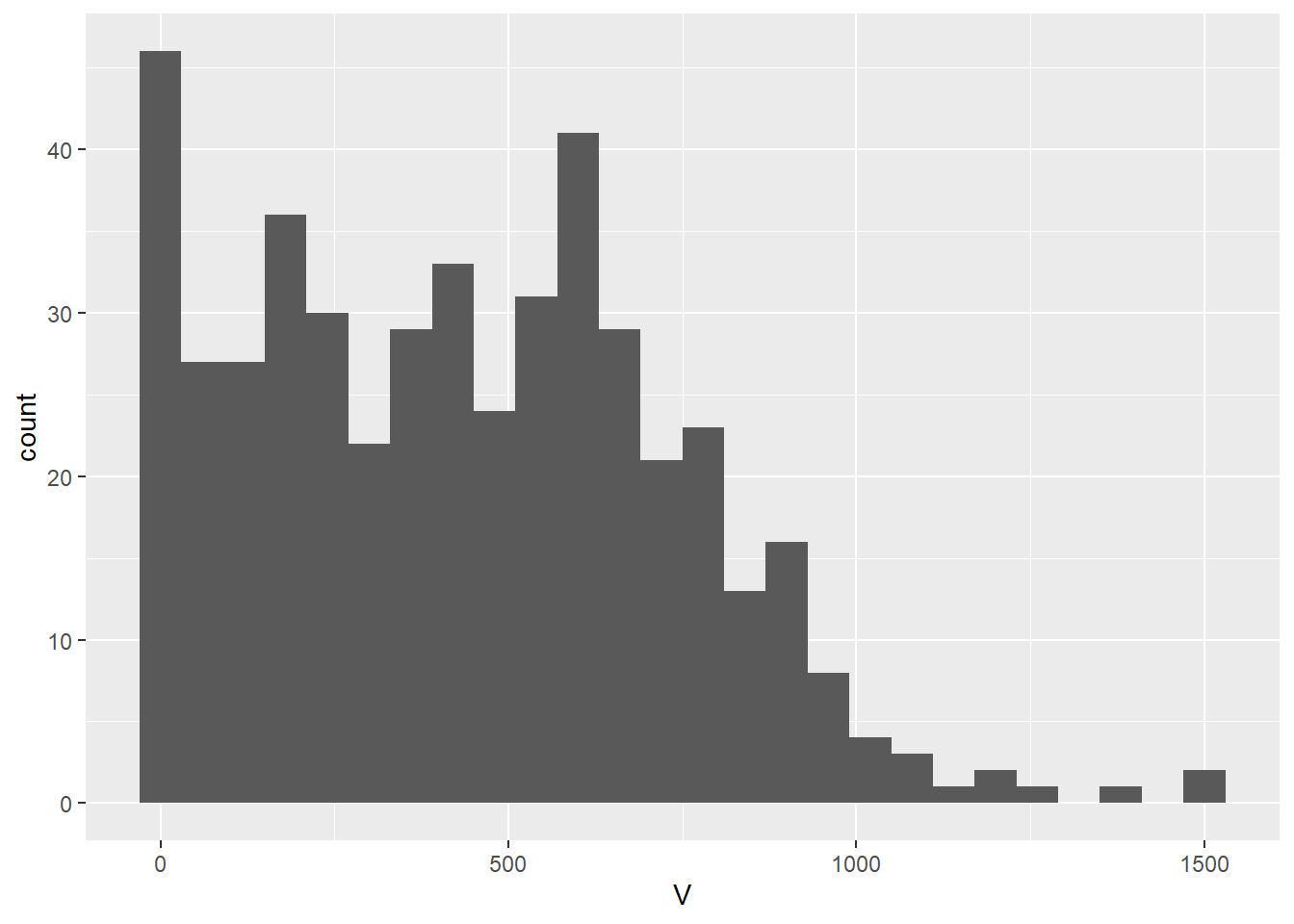
Clearly, there are no values of the variable less than zero, and values in excess of 1,000 are rare.
The standard deviation of the sample is:
## [1] 301.1554The standard deviation is the average deviation from the mean. We could use this value to say that typical deviations from our point estimates are a function of this standard deviation (to what extent, it depends on the underlying distribution).
A problem with using this approach is that the distribution of the variable is not normal, and the distribution of \(\hat{\epsilon}_p\) is unknown; the standard deviation is centered on the mean (meaning that it is a poor estimate for observations away from the mean); and in any case the standard deviation of the sample is too large for local point estimates if there is spatial pattern (since we know that the local mean will vary systematically).
There are other approaches to deal with non-normal variables, for instance Wilcox’s test, but some of the other limitations remain.
##
##  Wilcoxon signed rank test with continuity correction
##
## data:  Walker_Lake$V
## V = 100576, p-value < 2.2e-16
## alternative hypothesis: true location is not equal to 0
## 95 percent confidence interval:
##  418.7 475.6
## sample estimates:
## (pseudo)median
##          447.2
As an alternative, the local standard deviation could be used.
Consider the case of \(k\)-point means. The point estimate is based on the values of the \(k\)-nearest neighbors: \[ \hat{z}_p = \frac{\sum_{i=1}^n{w_{pi}z_i}}{\sum_{i=1}^n{w_{pi}}} \]
With: \[ w_{pi} = \bigg\{\begin{array}{ll} 1 & \text{if } i \text{ is one of } kth \text{ nearest neighbors of } p \text{ for a given }k \\ 0 & otherwise \\ \end{array} \]
The standard deviation could be calculated also based in the values of the \(k\)-nearest neighbors, meaning that it would be based on the local mean. Here, we will interpolate the field using the Walker Lake data. First create a target grid for interpolation, and extract the coordinates of observations:
# Create a prediction grid and convert to simple features:
target_xy = expand.grid(x = seq(0.5, 259.5, 2.2),
                        y = seq(0.5, 299.5, 2.2)) |>
  st_as_sf(coords = c("x", "y"))

# Convert the `Walker_Lake` dataframe to a simple features object using as follows:
Walker_Lake.sf <- Walker_Lake |>
  st_as_sf(coords = c("X", "Y"))
Interpolation using \(k=5\) neighbors:
kpoint.5 <- kpointmean(source_xy = Walker_Lake.sf,
                       target_xy = target_xy,
                       z = V,
                       k = 5) |>
  rename(V = z)
## projected pointsWe can plot the interpolated field now. These are the interpolated values:
ggplot() +
  geom_sf(data = kpoint.5,
          aes(color = V)) +
  scale_color_distiller(palette = "OrRd",
                       direction = 1)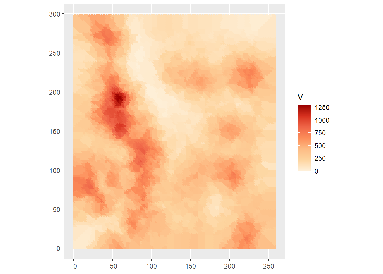
In addition, we can plot the local standard deviation:
ggplot() +
  geom_sf(data = kpoint.5,
          aes(color = sd)) +
  scale_color_distiller(palette = "OrRd",
                       direction = 1)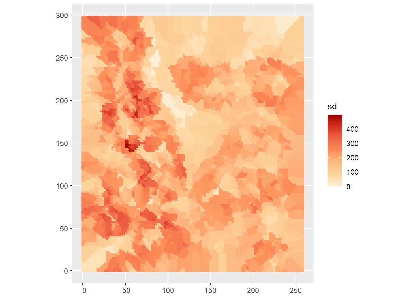
The local standard deviation indicates the typical deviation from the local mean. As expected, the local values of the standard deviation are usually lower than the standard deviation of the sample, and it tends to be larger for the tails, that is the locations where the values are rare - we have less information, hence greater uncertainty.
The local standard deviation is a crude estimator of the uncertainty because we do not know the underlying distribution. Other approaches based on bootstrapping (randomly sampling from the observed values of the variable) could be implemented, but they are beyond the scope of the present discussion.
The issue of assessing the level of uncertainty in the predictions with Voronoi polygons, IDW, and \(k\)-point means reflects the fact that these methods were not designed to deal explicitly with the random nature of predicting fields. Other methods deal with this issue more naturally. We will revisit two estimation methods that we covered before, and see how they can be applied to spatial interpolation.
33.5 Trend surface analysis
Trend surface analysis is a form of multivariate regression that uses the coordinates of the observations to fit a surface to the data.
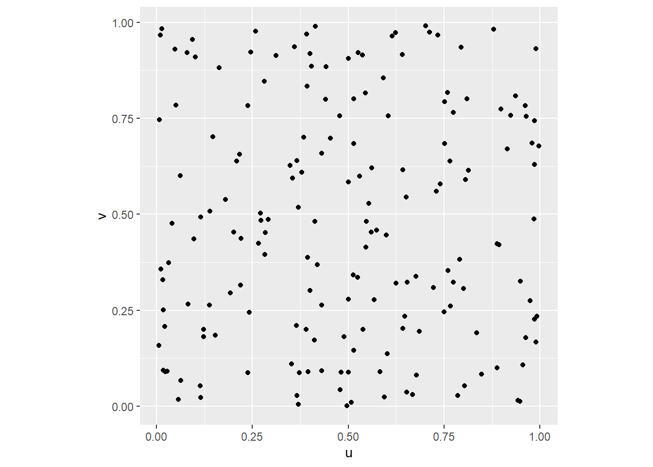
We can illustrate this technique by means of a simulated example. We will begin by simulating a set of observations, beginning with the coordinates in the square unit region:
# `n` is the number of observations to simulate
n <- 180

# Here we create a dataframe with these values: `u` and `v` will be the coordinates of our process
df <- data.frame(u = runif(n = n, min = 0, max = 1),
                 v = runif(n = n, min = 0, max = 1))
Once we have simulated the coordinates for the example, we can plot their locations:
We can now proceed to simulate a spatial process as follows:
# Use `mutate()` to create a new stochastic variable `z` that is a function of the coordinates and a random normal variable that we create with `rnorm()`; this random variable has a mean of zero and a standard deviation of 0.1.
df <- mutate(df, z = 0.5 + 0.3 * u + 0.7 * v + rnorm(n = n, mean = 0, sd = 0.1))
A 3D scatterplot can be useful to explore the data:
# Create a 3D scatterplot with the function `plot_ly()`. Notice that the way this function works is similar to `ggplot2`: the arguments are a dataframe, what should be plotted on the x-axis, the y-axis, the z-axis, and other aesthetics (aspects) of the plot. Here the color will be proportional to the values of `z`. The function `add_markers()` is similar to the family of `geom_` functions in `ggplot2`, but more general, since it will try to guess what you are trying to plot based on the inputs (in this case points). The function `layout()` is used to control other parts of the plot: here the `aspectratio` is selected so that the scale is identical for all three axes.
plot_ly(data = df, x = ~u, y = ~v, z = ~z, color = ~z) |>
  add_markers() |>
  layout(scene = list(
    aspectmode = "manual", aspectratio = list(x=1, y=1, z=1)))
We can fit a trend surface to the data as follows. This is a regression model that uses the coordinates of the observations as covariates. In this case, the trend is linear:
##
## Call:
## lm(formula = z ~ u + v, data = df)
##
## Residuals:
##       Min        1Q    Median        3Q       Max
## -0.289525 -0.073800  0.001302  0.076587  0.264279
##
## Coefficients:
##             Estimate Std. Error t value Pr(>|t|)
## (Intercept)  0.47209    0.01985   23.78   <2e-16 ***
## u            0.30158    0.02628   11.48   <2e-16 ***
## v            0.71575    0.02770   25.84   <2e-16 ***
## ---
## Signif. codes:  0 '***' 0.001 '**' 0.01 '*' 0.05 '.' 0.1 ' ' 1
##
## Residual standard error: 0.1073 on 177 degrees of freedom
## Multiple R-squared:  0.8337, Adjusted R-squared:  0.8318
## F-statistic: 443.5 on 2 and 177 DF,  p-value: < 2.2e-16
Given a trend surface model, we can estimate the value of the variable \(z\) at locations where it was not measured. Typically this is done by interpolating on a fine grid that can be used for visualization or further analysis, as shown next.
We will begin by creating a grid for interpolation. We will call the coordinates x.p and y.p. We generate these by creating a sequence of values in the domain of the data, for instance in the [0,1] interval:
For prediction, we want all combinations of x.p and y.p, so we expand these two vectors into a grid, by means of the function expand.grid():
# The function `expand.grid()` creates a grid with all the combination of values of the inputs.
df.p <- expand.grid(u = u.p, v = v.p)
Notice that while u.p and v.p are vectors of size 21, the dataframe df.p contains {r}21 * 21 observations, that is, all the combinations of u.p and v.p.
Once we have the coordinates for interpolation, the predict() function can be used in conjunction with the results of the estimation. When invoking the function, we indicate that we wish to obtain as well the standard errors of the fitted values (se.fit = TRUE), as well as the interval of the predictions at a 95% level of confidence:
The interval of confidence of the predictions at the 95% level of confidence is given in the form of the lower (lwr) and upper (upr) bounds:
##       fit              lwr              upr
##  Min.   :0.4721   Min.   :0.2568   Min.   :0.6873
##  1st Qu.:0.7942   1st Qu.:0.5797   1st Qu.:1.0080
##  Median :0.9808   Median :0.7685   Median :1.1930
##  Mean   :0.9808   Mean   :0.7673   Mean   :1.1942
##  3rd Qu.:1.1673   3rd Qu.:0.9535   3rd Qu.:1.3817
##  Max.   :1.4894   Max.   :1.2744   Max.   :1.7045
These values indicate that the predictions of \(z_p\) are, with 95% of confidence, in the following interval: \[ CI_{z_p} = [z_{p_{lwr}}, z_{p_{upr}}]. \]
A convenient way to visualize the results of the analysis above, that is, to inspect the trend surface and the interval of confidence of the predictions, is by means of a 3D plot as follows.
First create matrices with the point estimates of the trend surface (z.p), and the lower and upper bounds (z.p_l, z.p_u):
z.p <- matrix(data = preds$fit[,1], nrow = 21, ncol = 21, byrow = TRUE)
z.p_l <- matrix(data = preds$fit[,2], nrow = 21, ncol = 21, byrow = TRUE)
z.p_u <- matrix(data = preds$fit[,3], nrow = 21, ncol = 21, byrow = TRUE)
The plot is created using the coordinates used for interpolation (x.p and y.p) and the matrices with the point estimates z.p and the upper and lower bounds. The type of plot in the package plotly is a surface:
trend.plot <- plot_ly(x = ~u.p, y = ~v.p, z = ~z.p,
        type = "surface", colors = "YlOrRd") |>
  add_surface(x = ~u.p, y = ~v.p, z = ~z.p_l,
              opacity = 0.5, showscale = FALSE) |>
  add_surface(x = ~u.p, y = ~v.p, z = ~z.p_u,
              opacity = 0.5, showscale = FALSE) |>
  layout(scene = list(
    aspectmode = "manual", aspectratio = list(x = 1, y = 1, z = 1)))

trend.plot
In this way, we have not only an estimate of the underlying field, but also a measure of uncertainty for our predictions, since our estimated values are bound, with 95% confidence, between the lower and upper surfaces.
It is important to note that, although the confidence interval provides a measure of uncertainty, it does not provide an estimate of the prediction error \(\hat{\epsilon}_p\). This quantity cannot be calculated directly, because we do not know the true value of the field at location \(p\). We will revisit this point later.
For the time being, we will apply trend surface analysis to the Walker Lake dataset.
We will first calculate the polynomial terms of the coordinates, for instance to the 3rd degree (this can be done to any arbitrary degree, however keeping in mind the caveats discussed previously with respect to trend surface analysis):
Walker_Lake <- mutate(Walker_Lake,
                        X3 = X^3, X2Y = X^2 * Y, X2 = X^2,
                        XY = X * Y,
                        Y2 = Y^2, XY2 = X * Y^2, Y3 = Y^3)
We can proceed to estimate the following models.
Linear trend surface model:
##
## Call:
## lm(formula = V ~ X + Y, data = Walker_Lake)
##
## Residuals:
##     Min      1Q  Median      3Q     Max
## -576.05 -241.79   -4.77  201.48 1055.98
##
## Coefficients:
##             Estimate Std. Error t value Pr(>|t|)
## (Intercept) 589.5289    34.5547  17.061  < 2e-16 ***
## X            -1.0082     0.1903  -5.297 1.82e-07 ***
## Y            -0.2980     0.1727  -1.726   0.0851 .
## ---
## Signif. codes:  0 '***' 0.001 '**' 0.01 '*' 0.05 '.' 0.1 ' ' 1
##
## Residual standard error: 292.1 on 467 degrees of freedom
## Multiple R-squared:  0.06338,    Adjusted R-squared:  0.05937
## F-statistic:  15.8 on 2 and 467 DF,  p-value: 2.29e-07
Quadratic trend surface model:
##
## Call:
## lm(formula = V ~ X2 + X + XY + Y + Y2, data = Walker_Lake)
##
## Residuals:
##     Min      1Q  Median      3Q     Max
## -579.37 -220.93    3.96  200.66  997.30
##
## Coefficients:
##               Estimate Std. Error t value Pr(>|t|)
## (Intercept) 320.484250  70.904832   4.520 7.86e-06 ***
## X2            0.001145   0.003191   0.359  0.71994
## X            -0.325993   0.910872  -0.358  0.72059
## XY           -0.006281   0.002244  -2.799  0.00534 **
## Y             3.737955   0.722097   5.177 3.37e-07 ***
## Y2           -0.011409   0.002188  -5.215 2.77e-07 ***
## ---
## Signif. codes:  0 '***' 0.001 '**' 0.01 '*' 0.05 '.' 0.1 ' ' 1
##
## Residual standard error: 283.1 on 464 degrees of freedom
## Multiple R-squared:  0.1258, Adjusted R-squared:  0.1164
## F-statistic: 13.35 on 5 and 464 DF,  p-value: 3.571e-12
Cubic trend surface model:
WL.trend3 <- lm(formula = V ~ X3 + X2Y + X2 + X + XY + Y + Y2 + XY2 + Y3,
                data = Walker_Lake)
summary(WL.trend3)
##
## Call:
## lm(formula = V ~ X3 + X2Y + X2 + X + XY + Y + Y2 + XY2 + Y3,
## data = Walker_Lake)
##
## Residuals:
## Min 1Q Median 3Q Max
## -564.19 -197.41 7.91 194.25 929.72
##
## Coefficients:
## Estimate Std. Error t value Pr(>|t|)
## (Intercept) -8.620e+00 1.227e+02 -0.070 0.944035
## X3 1.533e-04 4.806e-05 3.190 0.001522 **
## X2Y 6.139e-05 3.909e-05 1.570 0.117000
## X2 -6.651e-02 1.838e-02 -3.618 0.000330 ***
## X 9.172e+00 2.386e+00 3.844 0.000138 ***
## XY -4.420e-02 1.430e-02 -3.092 0.002110 **
## Y 4.794e+00 2.040e+00 2.350 0.019220 *
## Y2 -1.806e-03 1.327e-02 -0.136 0.891822
## XY2 7.679e-05 2.956e-05 2.598 0.009669 **
## Y3 -4.170e-05 2.819e-05 -1.479 0.139759
## ---
## Signif. codes: 0 '***' 0.001 '**' 0.01 '*' 0.05 '.' 0.1 ' ' 1
##
## Residual standard error: 276.7 on 460 degrees of freedom
## Multiple R-squared: 0.1719, Adjusted R-squared: 0.1557
## F-statistic: 10.61 on 9 and 460 DF, p-value: 5.381e-15Inspection of the results of the three models above suggests that the cubic trend surface provides the best fit, with the highest adjusted coefficient of determination, even if the value is relatively low at approximately 0.16. Also, the cubic trend yields the smallest standard error, which implies that the intervals of confidence are tighter, and hence the degree of uncertainty is smaller.
We will compare two of these models to see how well they fit the data.
First, we create an interpolation grid. Summarize the information to ascertain the domain of the data:
##        X               Y
##  Min.   :  8.0   Min.   :  8.0
##  1st Qu.: 51.0   1st Qu.: 80.0
##  Median : 89.0   Median :139.5
##  Mean   :111.1   Mean   :141.3
##  3rd Qu.:170.0   3rd Qu.:208.0
##  Max.   :251.0   Max.   :291.0
We can see that the spatial domain is in the range of [8,251] in X, and [8,291] in Y. Based on this information, we will generate the following sequence that then is expanded into a grid for prediction:
X.p <- seq(from = 0.0, to = 255.0, by = 2.5)
Y.p <- seq(from = 0.0, to = 295.0, by = 2.5)
df.p <- expand.grid(X = X.p, Y = Y.p)
To this dataframe we add the polynomial terms:
df.p <- mutate(df.p, X3 = X^3, X2Y = X^2 * Y, X2 = X^2,
               XY = X * Y,
               Y2 = Y^2, XY2 = X * Y^2, Y3 = Y^3)
The interpolated quadratic surface is then obtained as:
WL.preds2 <- predict(WL.trend2, newdata = df.p, se.fit = TRUE, interval = "prediction", level = 0.95)Whereas the interpolated cubic surface is obtained as:
WL.preds3 <- predict(WL.trend3, newdata = df.p, se.fit = TRUE, interval = "prediction", level = 0.95)The predictions are transformed into matrices for plotting.
Quadratic trend surface and lower and upper bounds of the predictions:
z.p2 <- matrix(data = WL.preds2$fit[,1], nrow = 119, ncol = 103, byrow = TRUE)
z.p2_l <- matrix(data = WL.preds2$fit[,2], nrow = 119, ncol = 103, byrow = TRUE)
z.p2_u <- matrix(data = WL.preds2$fit[,3], nrow = 119, ncol = 103, byrow = TRUE)
Cubic trend surface and lower and upper bounds of the predictions:
z.p3 <- matrix(data = WL.preds3$fit[,1], nrow = 119, ncol = 103, byrow = TRUE)
z.p3_l <- matrix(data = WL.preds3$fit[,2], nrow = 119, ncol = 103, byrow = TRUE)
z.p3_u <- matrix(data = WL.preds3$fit[,3], nrow = 119, ncol = 103, byrow = TRUE)
This is the quadratic trend surface with its confidence interval of predictions:
WL.plot2 <- plot_ly(x = ~X.p, y = ~Y.p, z = ~z.p2,
        type = "surface", colors = "YlOrRd") |>
  add_surface(x = ~X.p, y = ~Y.p, z = ~z.p2_l,
              opacity = 0.5, showscale = FALSE) |>
  add_surface(x = ~X.p, y = ~Y.p, z = ~z.p2_u,
              opacity = 0.5, showscale = FALSE) |>
  layout(scene = list(
    aspectmode = "manual", aspectratio = list(x = 1, y = 1, z = 1)))
WL.plot2
And, this is the cubic trend surface with its confidence interval of predictions:
WL.plot3 <- plot_ly(x = ~X.p, y = ~Y.p, z = ~z.p3,
        type = "surface", colors = "YlOrRd") |>
  add_surface(x = ~X.p, y = ~Y.p, z = ~z.p3_l,
              opacity = 0.5, showscale = FALSE) |>
  add_surface(x = ~X.p, y = ~Y.p, z = ~z.p3_u,
              opacity = 0.5, showscale = FALSE) |>
  layout(scene = list(
    aspectmode = "manual", aspectratio = list(x = 1, y = 1, z = 1)))
WL.plot3
Alas, these models are not very reliable estimates of the underlying field. As can be seen from the plots, the confidence intervals are extremely wide, and in both cases include negative numbers in the lower bound. The uncertainty associated with these predictions is quite substantial.
Another question, however, is whether the point estimates are accurate. To get a sense of whether this is the case we can add the observations to the plot:
WL.plot3 |>
  add_markers(data = Walker_Lake, x = ~X, y = ~Y, z = ~V,
              color = ~V, opacity = 0.7, showlegend = FALSE)
Alas, the trend surface does a mediocre job with the point estimates as well.
A possible reason for this is that the model failed to capture all or even most of the systematic spatial variability of this field. To explore this, we will plot the residuals of the model, after labeling them as “positive” or “negative”:
Plot the residuals:
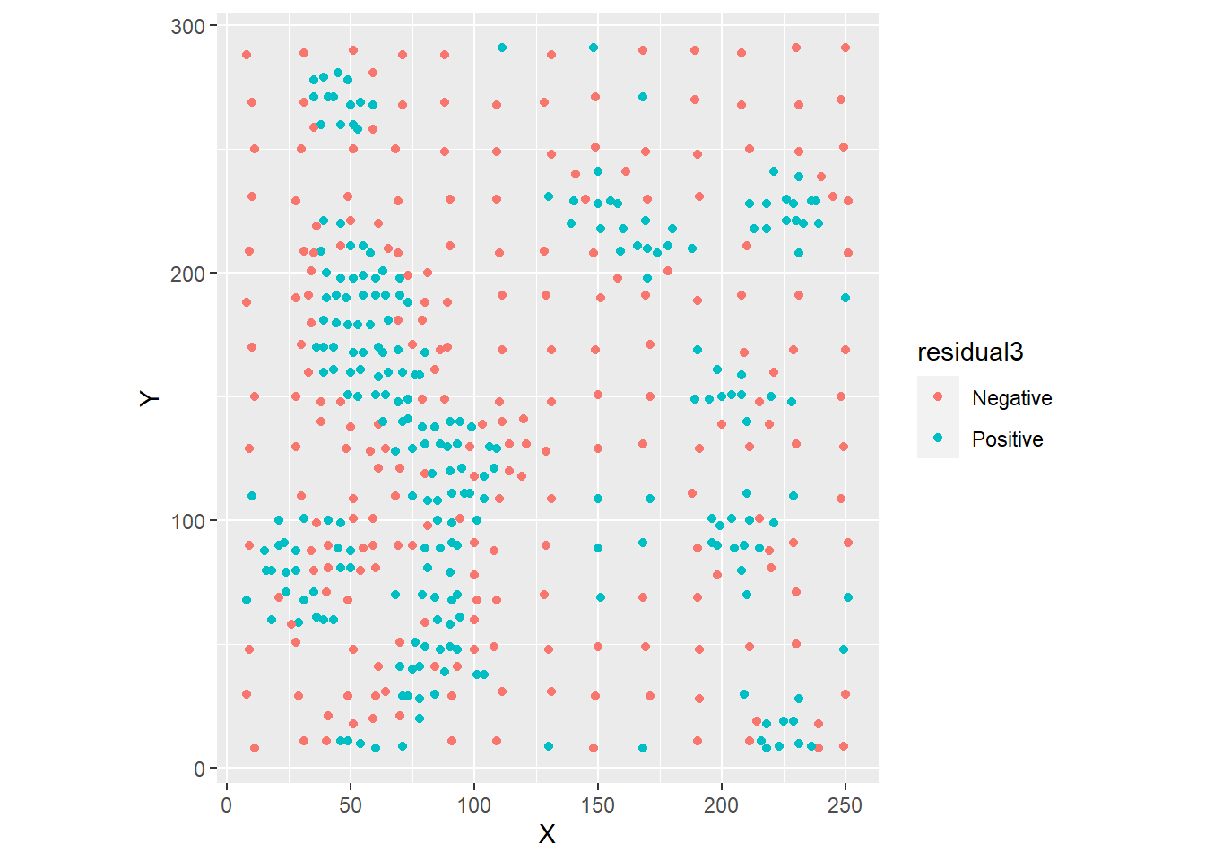
Visual inspection of the distribution of the residuals strongly suggests that they are not random. We can check this by means of Moran’s \(I\) coefficient, if we create a list of spatial weights as follows:
# Create a set of spatial weights with the 5 nearest neighbors.
WL.listw <- Walker_Lake[,2:3] |>
  as.matrix() |>
  knearneigh(k = 5) |>
  knn2nb() |>
  nb2listw()
The results of the autocorrelation analysis of the residuals are:
##
##  Moran I test under randomisation
##
## data:  WL.trend3$residuals
## weights: WL.listw
##
## Moran I statistic standard deviate = 17.199, p-value < 2.2e-16
## alternative hypothesis: greater
## sample estimates:
## Moran I statistic       Expectation          Variance
##      0.4633803457     -0.0021321962      0.0007325452
Given the low \(p\)-value, we fail to reject the null hypothesis, and conclude, with a high level of confidence, that the residuals are not independent. This has important implications for spatial interpolation, as we will discuss in the following chapter.
33.6 Accuracy and precision
Before concluding this chapter, it is worthwhile to make the following distinction between accuracy and precision of the estimates.
Accuracy refers to how close the predicted values \(\hat{z}_p\) are to the true values of the field. Precision refers to how much uncertainty is associated with such predictions. Narrow intervals of confidence imply greater precision, whereas the opposite is true when the intervals of confidence are wide.
An example of these two properties is as shown in Figure @ref{fig:accuracy-precision}.
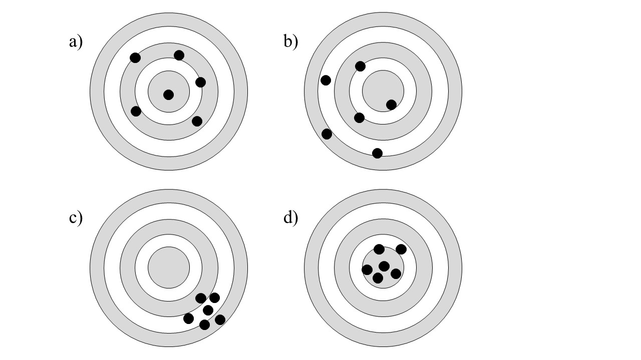
FIGURE 33.1: Accuracy and precision
Panel a) in the figure represents a set of accurate points, since they are on average close to the mark. However, they are imprecise, given their variability. This is akin to a good point estimate that has wide confidence intervals.
Panel b) is a set of inaccurate and imprecise points.
Panel c) is a set of precise but inaccurate points.
Finally, Panel d) is a set of accurate and precise points.
Accuracy and precision are important criteria when assessing the quality of a predictive model.
This concludes the chapter.