Chapter 27 Area Data V
NOTE: The source files for this book are available with companion package {isdas}. The source files are in Rmarkdown format and packed as templates. These files allow you execute code within the notebook, so that you can work interactively with the notes.
27.1 Learning Objectives
In the previous chapter, you learned how to decompose Moran’s \(I\) coefficient into local versions of an autocorrelation statistic. You also learned about a concentration statistics, and saw how these local spatial statistics can be used for exploratory spatial data analysis, for example to search for “hot” and “cold” spots. In this practice, you will:
- Practice how to estimate regression models in
R. - Learn about autocorrelation as a model diagnostic.
- Learn about variable transformations.
- Use autocorrelation analysis to improve regression models.
27.2 Suggested Readings
- Bailey TC and Gatrell AC (1995) Interactive Spatial Data Analysis, Chapter 7. Longman: Essex.
- Bivand RS, Pebesma E, and Gomez-Rubio V (2008) Applied Spatial Data Analysis with R, Chapter 9. Springer: New York.
- Brunsdon C and Comber L (2015) An Introduction to R for Spatial Analysis and Mapping, Chapter 7. Sage: Los Angeles.
- O’Sullivan D and Unwin D (2010) Geographic Information Analysis, 2nd Edition, Chapter 7. John Wiley & Sons: New Jersey.
27.3 Preliminaries
As usual, it is good practice to restart your R session, or at least clear the working space to make sure that you do not have extraneous items there when you begin your work. The command in R to clear the workspace is rm (for “remove”), followed by a list of items to be removed. To clear the workspace from all objects, do the following:
Note that ls() lists all objects currently on the workspace.
Load the libraries you will use in this activity:
Next, read an object of class sf (simple feature) with the census tracts of Hamilton CMA and some selected population variables from the 2011 Census of Canada. This dataset will be used for examples in this chapter:
27.4 Regression Analysis in R
Regression analysis is one of the most powerful techniques in the repertoire of data analysis. There are many different forms of regression, and they usually take the following form: \[ y_i = f(x_{ij}) + \epsilon_i \]
This is a model for a stochastic process. The outcome is \(y_i\), which could be the observed values of a variable \(y\) at locations \(i\). We will think of these locations as areas, but they could as well be points, nodes on a network, links on a network, etc. The model consists of two components: a systematic/deterministic part, that is \(f(x_{ij})\), which is a function of a collection of variables \(x_{i1}, x_{i2}, \cdots, x_{ij}, \cdots, x{ik}\); and a random part, captured by the term \(\epsilon_i\).
In this chapter we will deal with one specific form of regression, namely linear regression. A linear regression model posits (as the name implies) linear relationships between an outcome, called a dependent variable, and one or more covariates, called independent variables. It is important to note that regression models capture statistical relationships, not causal relationships. Even so, causality is often implied by the choice of independent variables. In a way, regression analysis is a tool to infer process from pattern: it is a formula that aims to retrieve the elements of the process based on our observations of the outcome.
This is the form of a linear regression model: \[ y_i = f(x_{ij}) + \epsilon_i = \beta_0 + \sum_{j=1}^k{\beta_jx_{ij}} + \epsilon_i \] where \(y_i\) is the dependent variable and \(x_ij\) (\(j=1,...,k\)) are the independent variables. The coefficients \(\beta\) are not known, but can be estimated from the data. And \(\epsilon_i\) is the random term, which in regression analysis is often called a residual (or error), because it is the difference between the systematic term of the model and the value of \(y_i\): \[ \epsilon_i = y_i - \bigg(\beta_0 + \sum_{j=1}^k{\beta_jx_{ij}}\bigg) \]
Estimation of a linear regression model is the procedure used to obtain values for the coefficients. This typically involves defining a loss function that needs to be minimized. In the case of linear regression, a widely used estimation procedure is least squares. This procedure allows a modeler to find the coefficients that minimize the sum of squared residuals, which become the loss function for the procedure. In very simple terms, the protocol is as follows: \[ \text{Find the values of }\beta\text{ that minimize }\sum_{i=1}^n{\epsilon_i^2} \]
For this procedure to be valid, there are a few assumptions that need to be satisfied, including:
The functional form of the model is correct.
The independent variables are not collinear; this is often diagnosed by calculating the correlations among the independent variables, with values greater than 0.8 often being problematic.
The residuals have a mean of zero: \[ E[\epsilon_i|X]=0 \]
The residuals have constant variance: \[ Var[\epsilon_i|X] = \sigma^2 \text{ }\forall i \]
The residuals are independent, that is, they are not correlated among them: \[ E[\epsilon_i\epsilon_j|X] = 0 \text{ }\forall i\neq j \]
The last three assumptions ensure that the residuals are random. Violation of these assumptions is often a consequence of a failure in the first two (i.e., the model was not properly specified, and/or the residuals are not exogenous).
When all these assumptions are met, the coefficients are said to be BLUE: Best Linear Unbiased Estimates - a desirable property because we wish to be able to quantify the relationships between covariates without bias.
This section provides a refresher on linear regression, before reviewing the estimation of regression models in R. The basic command for multivariate linear regression in R is lm(), for “linear model”. This is the help file of this function:
# Remember that we can search the definition of a function by using a question mark in front of the function itself.
?lm
We will see now how to estimate a model using this function. The example we will use is of urban population density gradients. Population density gradients are representations of the variation of population density in cities. These gradients are of interest because they are related to land rent, urban form, and commuting patterns, among other things (see accompanying reading for more information).
Urban economic theory suggests that population density declines with distance from the central business district of a city, or its CBD. This leads to the following model, where the population density at location \(i\) is a function of the distance of \(i\) to the CBD. Since this is likely a stochastic process, we allow for some randomness by means of the residuals: \[ P_i = f(D_i) + \epsilon_i \]
To implement this model, we need to add distance to the CBD as a covariate in our dataframe. We will use Jackson Square, a central shopping mall in Hamilton, as the CBD of the city:
# Create a small data frame with the coordinates of Jackson Square; these coordinates,
# which are in lat-long are converted into a simple features table, with coordinate
# reference system epsg:4326 (for lat-long); finally, we transform the coordinates to
# the same coordinate reference system of our Hamilton census tracts, which we retrieve
# with the function `st_crs()`
xy_cbd <- data.frame(x = -79.8708,
                     y = 43.2584) |>
  st_as_sf(coords = c("x", "y"),
           crs = 4326) |>
  st_transform(st_crs(Hamilton_CT))
To calculate the distance from the census tracts to the CBD, we retrieve the centroids of the census tracts:
# We need to retrieve the centroids of Hamilton_CT by using 'coordinates'
xy_ct <- st_centroid(Hamilton_CT)
## Warning: st_centroid assumes attributes are constant over geometriesGiven these coordinates, the function geosphere::distGeo can be used to calculate the great circle distance between the centroids of the census tracts and Hamilton’s CBD. Call this dist2cbd.sl, i.e., straight line distance to CBD in a straight:
# Function `st_distance()` is used to calculate the distance between two sets
# of points. Here, we use it to calculate the distance from the centroids of
# the census tracts to the coordinates of the CBD. We will call this variable
# `dist.sl`, for "straight line" to remind us what kind of distance this is.
dist.sl <- st_distance(xy_ct,
                       xy_cbd)
Next. we add our new variable distance to CBD to our dataframe Hamilton_CT for analysis:
Regression analysis is implemented in R by means of the lm function. The arguments of the model include an object of type “formula” and a dataframe. Other arguments include conditions for subsetting the data, using sampling weights, and so on.
A formula is written in the form y ~ x1 + x2, and more complex expressions are possible too, as we will see below. For the time being, the formula is simply POP_DENSIT ~ dist.sl:
# The function `lm()` implements regression analysis in `R`. Recall that 'dist.sl' is the distance from the CBD (Jackson Square)
model1 <- lm(formula = POP_DENSITY ~ dist.sl, data = Hamilton_CT)
summary(model1)
##
## Call:
## lm(formula = POP_DENSITY ~ dist.sl, data = Hamilton_CT)
##
## Residuals:
## Min 1Q Median 3Q Max
## -3841.2 -1338.3 -177.1 950.8 10009.1
##
## Coefficients:
## Estimate Std. Error t value Pr(>|t|)
## (Intercept) 4405.13325 250.16396 17.609 < 2e-16 ***
## dist.sl -0.17994 0.02419 -7.439 3.63e-12 ***
## ---
## Signif. codes: 0 '***' 0.001 '**' 0.01 '*' 0.05 '.' 0.1 ' ' 1
##
## Residual standard error: 1892 on 186 degrees of freedom
## Multiple R-squared: 0.2293, Adjusted R-squared: 0.2251
## F-statistic: 55.33 on 1 and 186 DF, p-value: 3.633e-12The value of the function is an object of class lm that contains the results of the estimation, including the coefficients with their diagnostics, and the coefficient of multiple determination, among other items.
Notice how the coefficient for distance is negative (and significant). This indicates that population density declines with increasing distance: \[ P_i = f(D_i) + \epsilon_i = 4405.15414 - 0.17989D_i + \epsilon_i \]
27.5 Autocorrelation as a Model Diagnostic
We can quickly explore the fit of the model. Since our model contains only one independent variable, we can use a scatterplot to see how it relates to population density. The points in the scatterplot are the actual population density and the distance to CBD. We also use the function geom_abline() to add the regression line to the plot, in blue:
ggplot(data = Hamilton_CT, aes(x = dist.sl,
                               y = POP_DENSITY)) +
  geom_point() +
  geom_abline(slope = model1$coefficients[2], # Recall that `geom_abline()` draws a line with intercept and slope as defined. Here the line is drawn using the coefficients of the regression model we estimated above.
              intercept = model1$coefficients[1],
              color = "blue",
              linewidth = 1)
## Warning: The `scale_name` argument of `continuous_scale()` is deprecated as of ggplot2
## 3.5.0.
## This warning is displayed once every 8 hours.
## Call `lifecycle::last_lifecycle_warnings()` to see where this warning was
## generated.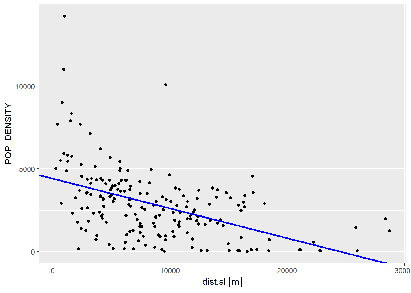
Clearly, there remains a fair amount of noise after this model (the scatter of the dots around the regression line). In this case, the regression line captures the general trend of the data, but seems to underestimate most of the high population density areas closer to the CBD, and it also overestimates many of the low population areas.
If the pattern of under- and over-estimation is random (i.e., the residuals are random), that would indicate that the model successfully retrieved all the systematic pattern. If the pattern is not random, there is a violation of assumption of independence. To explore this issue, we will add the residuals of the model to the dataframe:
# Here we add the residuals from 'model1' to the dataframe, with the name `model1.e`
Hamilton_CT$model1.e <- model1$residuals
Since we are interested in statistical maps, we will create a map of the residuals. In this map, we will use red to indicate negative residuals (values of the dependent variable that the model overestimates), and blue for positive residuals (values of the dependent variable that the model underestimates):
# Recall that 'plot_ly()' is a function used to create interactive plots
plot_ly(Hamilton_CT) |>
  # Recall that `add_sf()` is similar to `geom_sf()` and it draws a simple features object on a `plotly` plot. This example adds colors to represent positive (blue) and negative residuals (red).
  add_sf(type = "scatter",
         color = ~(model1.e > 0),
         colors = c("red",
                    "dodgerblue4"))
In the legend of the plot, “TRUE” means that the residual is positive, and “FALSE” that it is negative. Does the spatial distribution of residuals look random?
In this case, visual inspection is very suggestive. In addition, we have the tools to help us with this question, in particular how to make a decision while quantifying our levels of confidence: the \(p\)-values of Moran’s \(I\) coefficient, for instance. We will create a set of spatial weights:
# Here, we use use `poly2nb()` to create a list of neighbors, based on the criterion of adjacency. Next, we pass that list of neighbors to `nb2listw()` to create a set of spatial weights.
#Hamilton_CT.w <- Hamilton_CT.sp |>
Hamilton_CT.w <- Hamilton_CT |>
  poly2nb() |>
  nb2listw()
Once that we have a set of spatial weights, we can calculate Moran’s \(I\):
##
##  Moran I test under randomisation
##
## data:  Hamilton_CT$model1.e
## weights: Hamilton_CT.w
##
## Moran I statistic standard deviate = 9.7448, p-value < 2.2e-16
## alternative hypothesis: greater
## sample estimates:
## Moran I statistic       Expectation          Variance
##       0.395387645      -0.005347594       0.001691093
The results of Moran coefficient support our visual inspection of the map. Notice how we can reject the null hypothesis (spatial randomness) at a very high level of confidence (see the extremely small value of \(p\)).
Spatial autocorrelation, as mentioned above, is a violation of a key assumption of linear regression, and likely the consequence of a model that was not correctly specified, either because the functional form was incorrect (e.g., the relationship was not linear), or there are missing covariates.
We will explore the first of these possibilities by means of variable transformations.
27.6 Variable Transformations
The term linear regression refers to the linearity in the coefficients. Variable transformations allow you to consider non-linear relationships between covariates, while still preserving the linearity of the coefficients.
For instance, a possible transformation of the variable distance could be its inverse: \[ f(D_i) = \beta_0 + \beta_1\frac{1}{D_i} \]
Here, we will create a new covariate that is the inverse distance:
# Recall that the function `mutate()` adds new variables to an exist dataframe, while preserving those that already exist. Here, we use our variable with the distance to the CBD to create a new variable that is the inverse distance.
Hamilton_CT <- mutate(Hamilton_CT,
                      invdist.sl = 1/dist.sl)
Once we have the inverse distance, we can estimate a second model using it as the covariate:
# Notice how the new 'model2' uses the inverse distance from the CBD rather than the original distance.
model2 <- lm(formula = POP_DENSITY ~ invdist.sl,
             data = Hamilton_CT)
summary(model2)
##
## Call:
## lm(formula = POP_DENSITY ~ invdist.sl, data = Hamilton_CT)
##
## Residuals:
## Min 1Q Median 3Q Max
## -6763 -1375 -52 1108 9675
##
## Coefficients:
## Estimate Std. Error t value Pr(>|t|)
## (Intercept) 2299.6 164.4 13.988 < 2e-16 ***
## invdist.sl 2259818.2 341936.7 6.609 3.97e-10 ***
## ---
## Signif. codes: 0 '***' 0.001 '**' 0.01 '*' 0.05 '.' 0.1 ' ' 1
##
## Residual standard error: 1940 on 186 degrees of freedom
## Multiple R-squared: 0.1902, Adjusted R-squared: 0.1858
## F-statistic: 43.68 on 1 and 186 DF, p-value: 3.967e-10As the scatterplot below shows (as before, the blue line is the regression line), we can capture a non-linear relationship. This model does a somewhat better job of describing the high density of tracts close to the CBD. Unfortunately, it is a poor description of density almost everywhere else:
ggplot(data = Hamilton_CT,
       aes(x = dist.sl,
           y = POP_DENSITY)) +
  geom_point() +
  stat_function(fun=function(x)model2$coefficients[1] + model2$coefficients[2]/x,
                geom="line",
                color = "blue",
                linewdith = 1)
## Warning in stat_function(fun = function(x) model2$coefficients[1] +
## model2$coefficients[2]/x, : Ignoring unknown parameters: `linewdith`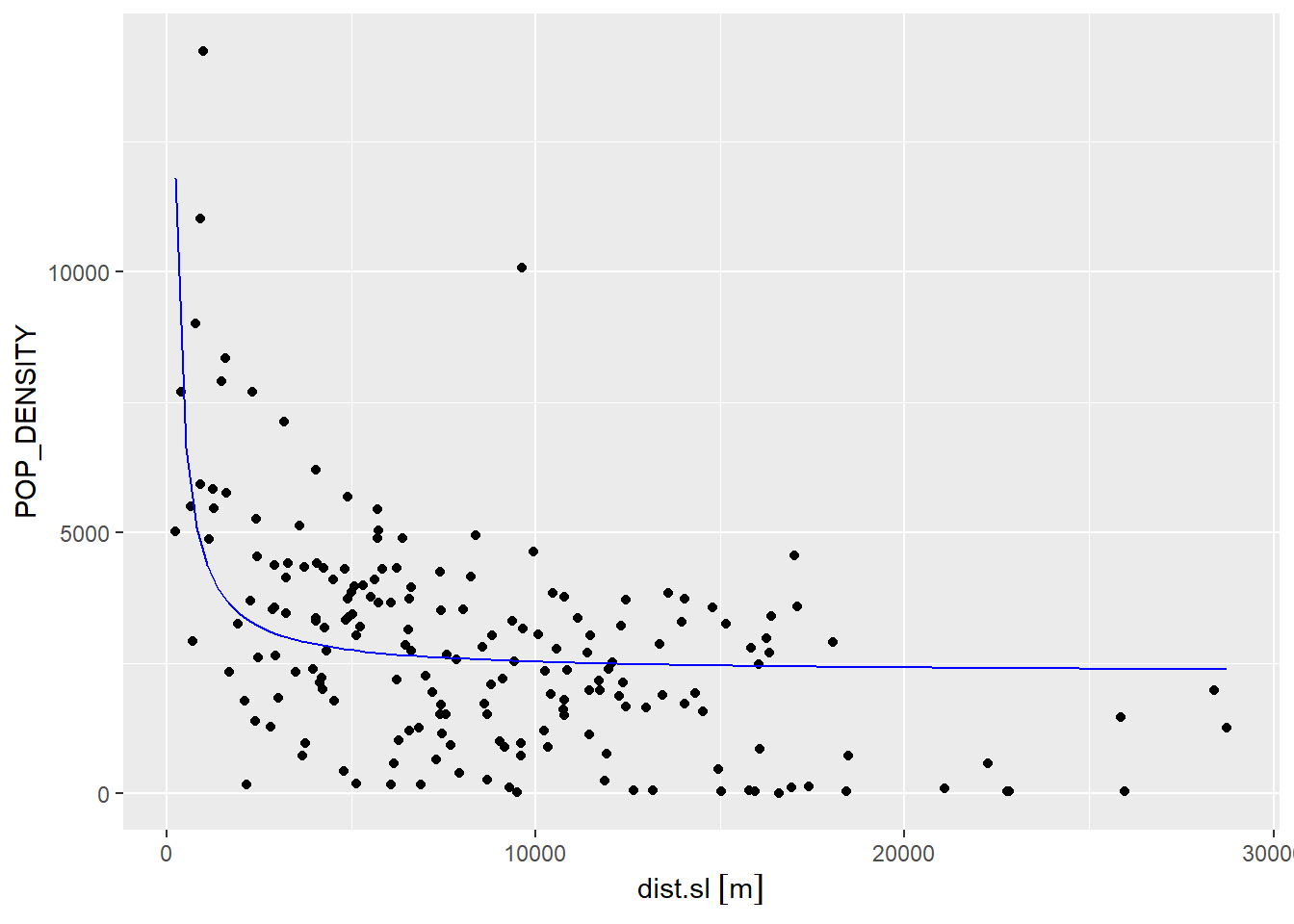
We will add the residuals of this model to the dataframe for further examination, in particular testing for spatial autocorrelation:
If we calculate Moran’s \(I\), we notice that the coefficient is lower than for the previous model but the \(p\)-value is still very low, which means that we can confidently reject the hypothesis that the residuals are random. But we would actually prefer to not reject this hypothesis, since we would like the residuals to be random!
##
##  Moran I test under randomisation
##
## data:  Hamilton_CT$model2.e
## weights: Hamilton_CT.w
##
## Moran I statistic standard deviate = 8.8236, p-value < 2.2e-16
## alternative hypothesis: greater
## sample estimates:
## Moran I statistic       Expectation          Variance
##       0.358134126      -0.005347594       0.001696970
The results of the test suggest that the model still fails at capturing the systematic aspects of population density gradients, so we need to investigate this further.
The literature on population density gradients suggests other non-linear transformations, including: \[ f(D_i) = exp(\beta_0)exp(\beta_1x_i) \]
This function is no longer linear in the coefficients (since the coefficients \(\beta_0\) and \(beta_1\) are transformed by the exponential). Fortunately, there is a simple way of changing this to a linear expression, by taking the logarithm on both sides of the equation: \[ ln(P_i) = \beta_0 + \beta_1x_i \]
By transforming the dependent variable we obtain a function that is linear in the parameters. To implement this model, we need to create a new variable that is the logarithm of population density:
# Here we mutate the population density by taking its natural logarithm of both sides of the equation. This changes the coefficients back to a linear expression.
Hamilton_CT <- Hamilton_CT |>
  mutate(lnPOP_DEN = log(POP_DENSITY))
This allows us to estimate a third model, as follows:
##
## Call:
## lm(formula = lnPOP_DEN ~ dist.sl, data = Hamilton_CT)
##
## Residuals:
##     Min      1Q  Median      3Q     Max
## -5.5857 -0.3395  0.2970  0.6897  2.4224
##
## Coefficients:
##               Estimate Std. Error t value Pr(>|t|)
## (Intercept)  8.465e+00  1.588e-01  53.293  < 2e-16 ***
## dist.sl     -1.161e-04  1.536e-05  -7.561 1.77e-12 ***
## ---
## Signif. codes:  0 '***' 0.001 '**' 0.01 '*' 0.05 '.' 0.1 ' ' 1
##
## Residual standard error: 1.202 on 186 degrees of freedom
## Multiple R-squared:  0.2351, Adjusted R-squared:  0.231
## F-statistic: 57.17 on 1 and 186 DF,  p-value: 1.773e-12
We can recreate the scatterplot and add the regression line. Notice that to create the line, we revert the coefficients to the exponential form of the model:
ggplot(data = Hamilton_CT,
       aes(x = dist.sl,
           y = POP_DENSITY)) +
  geom_point() +
  stat_function(fun=function(x)exp(model3$coefficients[1] + model3$coefficients[2] * x),
                geom="line",
                color = "blue",
                linewidth = 1)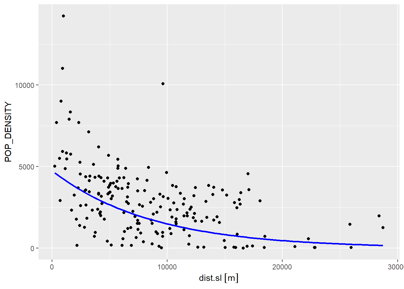
As before, we can add the residuals of the model to the dataframe for further examination:
While this latest model provides a somewhat better fit, there is still systematic under- and over-prediction, as seen in the map below (red are negative residuals and blue are positive):
plot_ly(Hamilton_CT) |>
  add_sf(type = "scatter",
         color = ~(model3.e > 0),
         colors = c("red",
                    "dodgerblue4"))
Moran’s \(I\) as well strongly suggests that the residuals are still not random/independent:
##
##  Moran I test under randomisation
##
## data:  Hamilton_CT$model3.e
## weights: Hamilton_CT.w
##
## Moran I statistic standard deviate = 8.0158, p-value = 5.47e-16
## alternative hypothesis: greater
## sample estimates:
## Moran I statistic       Expectation          Variance
##       0.325935548      -0.005347594       0.001708056
27.7 A Note about Spatial Autocorrelation in Regression Analysis
Spatial autocorrelation was originally seen as a problem in regression analysis. It is not difficult to see why, after testing three models in this chapter.
My preference is to view spatial autocorrelation as an opportunity for discovery. For instance, the models above all seem to struggle to capture the large variations in population density between the central parts of the city and the suburbs of Hamilton. Perhaps this could be due to a regime change, or in other words, the presence of an underlying process that operates somewhat differently in different parts parts of the city. The latest model we estimated (model3), for instance, suggests that the close proximity of Burlington might have an effect.
The analysis that follows is somewhat more advanced, but serves to illustrate the idea of spatial autocorrelation as a tool for discovery.
We will begin by creating local Moran maps to identify potential “hot” and “cold” spots of population density. We can envision these as representing different spatial regimes:
Examination of the map above, suggests that there are possibly three regimes: a CBD (“HH” and significant tracts), Suburbs (“LL” and significant tracts), and Other (not significant tracts). Based on this, we will create two indicator variables, one for census tracts in the CBD and another for census tracts in the Suburbs. An indicator variable takes values of 1 or zero, depending on whether a condition is true. For instance, all census tracts in the CBD will take the value of 1 in the CBD indicator variable, and all others will be zero.
Begin by computing the local statistics:
POP_DEN.lm <- localmoran(Hamilton_CT$POP_DENSITY,
                         listw = Hamilton_CT.w)

colnames(POP_DEN.lm) <- c("Ii", "E.Ii", "Var.Ii", "Z.Ii", "p.val")
Next, we will identify the type of tract based on the spatial relationships according to the local statistics (i.e., “HH”, “LL”, or “HL/LH”).
df_msc <- Hamilton_CT |>
  transmute(TRACT = TRACT,
            Z = (POP_DENSITY - mean(POP_DENSITY)) / var(POP_DENSITY),
            SMA = lag.listw(Hamilton_CT.w, Z),
            Type = case_when(Z < 0 & SMA < 0 ~ "LL",
                             Z > 0 & SMA > 0 ~ "HH",
                             TRUE ~ "HL/LH"))
After that, identify as CBD all tracts for which Type is “HH” and the p-value is less than or equal to 0.05. Likewise, identify as Suburb all tracts for which Type is “LL” and the \(p\)-value is also less than or equal to 0.05:
df_msc <- cbind(df_msc,
                POP_DEN.lm)

CBD <- ifelse(df_msc$Type == "HH" & df_msc$p.val < 0.05,
              1,
              0)
Suburb <- ifelse(df_msc$Type == "LL" & df_msc$p.val < 0.05,
                 1,
                 0)
We then add the indicator variables to the dataframe:
The model that I propose to estimate is a variation of the last non-linear specification, but with regime breaks: \[ ln(P_i) = \beta_0 + \beta_1x_i + \beta_2CBD_i + \beta_3Suburb_i + \beta_4CBD_ix_i + \beta_5Suburb_ix_i + \epsilon_i \]
Since the indicator variables for CBD and Suburb take values of zero and one, effectively we have the following: \[ ln(P_i)=\Bigg\{\begin{array}{l l} (\beta_0 + \beta_2) + (\beta_1 + \beta_2)x_i + \epsilon_i \text{ if census tract } i \text{ is in the CBD}\\ (\beta_0 + \beta_3) + (\beta_1 + \beta_5)x_i + \epsilon_i \text{ if census tract } i \text{ is in the Suburbs}\\ \beta_0 + \beta_1x_i + \epsilon_i \text{ otherwise}\\ \end{array} \]
Notice that the model now allows for different slopes and intercepts for observations in different parts of the city. Estimate the model:
model4 <- lm(formula = lnPOP_DEN ~ CBD + Suburb + dist.sl + CBD:dist.sl + Suburb:dist.sl,
             data = Hamilton_CT)
summary(model4)
##
## Call:
## lm(formula = lnPOP_DEN ~ CBD + Suburb + dist.sl + CBD:dist.sl +
## Suburb:dist.sl, data = Hamilton_CT)
##
## Residuals:
## Min 1Q Median 3Q Max
## -6.2749 -0.2739 0.2398 0.5639 2.1412
##
## Coefficients:
## Estimate Std. Error t value Pr(>|t|)
## (Intercept) 7.985e+00 1.730e-01 46.160 < 2e-16 ***
## CBD 9.573e-01 4.779e-01 2.003 0.04664 *
## Suburb -4.277e-01 6.140e-01 -0.697 0.48695
## dist.sl -4.569e-05 1.723e-05 -2.651 0.00872 **
## CBD:dist.sl -5.005e-05 2.250e-04 -0.222 0.82423
## Suburb:dist.sl -1.047e-04 4.149e-05 -2.523 0.01250 *
## ---
## Signif. codes: 0 '***' 0.001 '**' 0.01 '*' 0.05 '.' 0.1 ' ' 1
##
## Residual standard error: 1.049 on 182 degrees of freedom
## Multiple R-squared: 0.429, Adjusted R-squared: 0.4133
## F-statistic: 27.35 on 5 and 182 DF, p-value: < 2.2e-16This model provides a much better fit than the preceding models (see the the coefficient of multiple determination).
We can visually examine the spatial distribution of the residuals by means of the following map:
Hamilton_CT$model4.e <- model4$residuals
plot_ly(Hamilton_CT) |>
  add_sf(type = "scatter",
         color = ~(model4.e > 0),
         colors = c("red",
                    "dodgerblue4"))
It is not clear from the visual inspection that the residuals are independent, but this can be tested as usual by means of Moran’s \(I\) coefficient:
##
##  Moran I test under randomisation
##
## data:  Hamilton_CT$model4.e
## weights: Hamilton_CT.w
##
## Moran I statistic standard deviate = 2.267, p-value = 0.0117
## alternative hypothesis: greater
## sample estimates:
## Moran I statistic       Expectation          Variance
##       0.086767905      -0.005347594       0.001651087
Based on the results, we can still reject the null hypothesis at a high level of confidence (since the \(p\)-value is 0.0117); however we also see that the model has been able to absorb more of the residual autocorrelation than the preceding alternatives, and provides a better statistical fit to the variable population density (with a higher \(R^2\)).
The following figure illustrates this last model:
# We will create three functions to represent each of the three regimes in `model4`
fun.1 <- function(x)exp(model4$coefficients[1] + model4$coefficients[2] + (model4$coefficients[4]  + model4$coefficients[4]) * x) #CBD
fun.2 <- function(x)exp(model4$coefficients[1] + model4$coefficients[3] + (model4$coefficients[4] + model4$coefficients[6]) * x) #Suburb
fun.3 <- function(x)exp(model4$coefficients[1] + model4$coefficients[4] * x) #Other

ggplot(data = Hamilton_CT, aes(x = dist.sl, y = POP_DENSITY)) +
  geom_point() +
  geom_point(data = filter(Hamilton_CT, CBD == 1),
             color = "Red") +
  geom_point(data = filter(Hamilton_CT, Suburb == 1),
             color = "Blue") +
  # `stat_function()` draws custom functions on a `ggplot2` plot.
  stat_function(fun= fun.1,
                geom="line",
                linewdith = 1,
                aes(color = "CBD")) +
  stat_function(fun=fun.2,
                geom="line",
                linewdith = 1,
                aes(color = "Suburb")) +
  stat_function(fun=fun.3,
                geom="line",
                linewdith = 1,
                aes(color = "Other")) +
  # Set the colors of the regression lines
  scale_color_manual(values = c("CBD" = "red",
                                "Other" = "black",
                                "Suburb" = "blue"))
## Warning in stat_function(fun = fun.1, geom = "line", linewdith = 1, aes(color =
## "CBD")): Ignoring unknown parameters: `linewdith`## Warning in stat_function(fun = fun.2, geom = "line", linewdith = 1, aes(color =
## "Suburb")): Ignoring unknown parameters: `linewdith`## Warning in stat_function(fun = fun.3, geom = "line", linewdith = 1, aes(color =
## "Other")): Ignoring unknown parameters: `linewdith`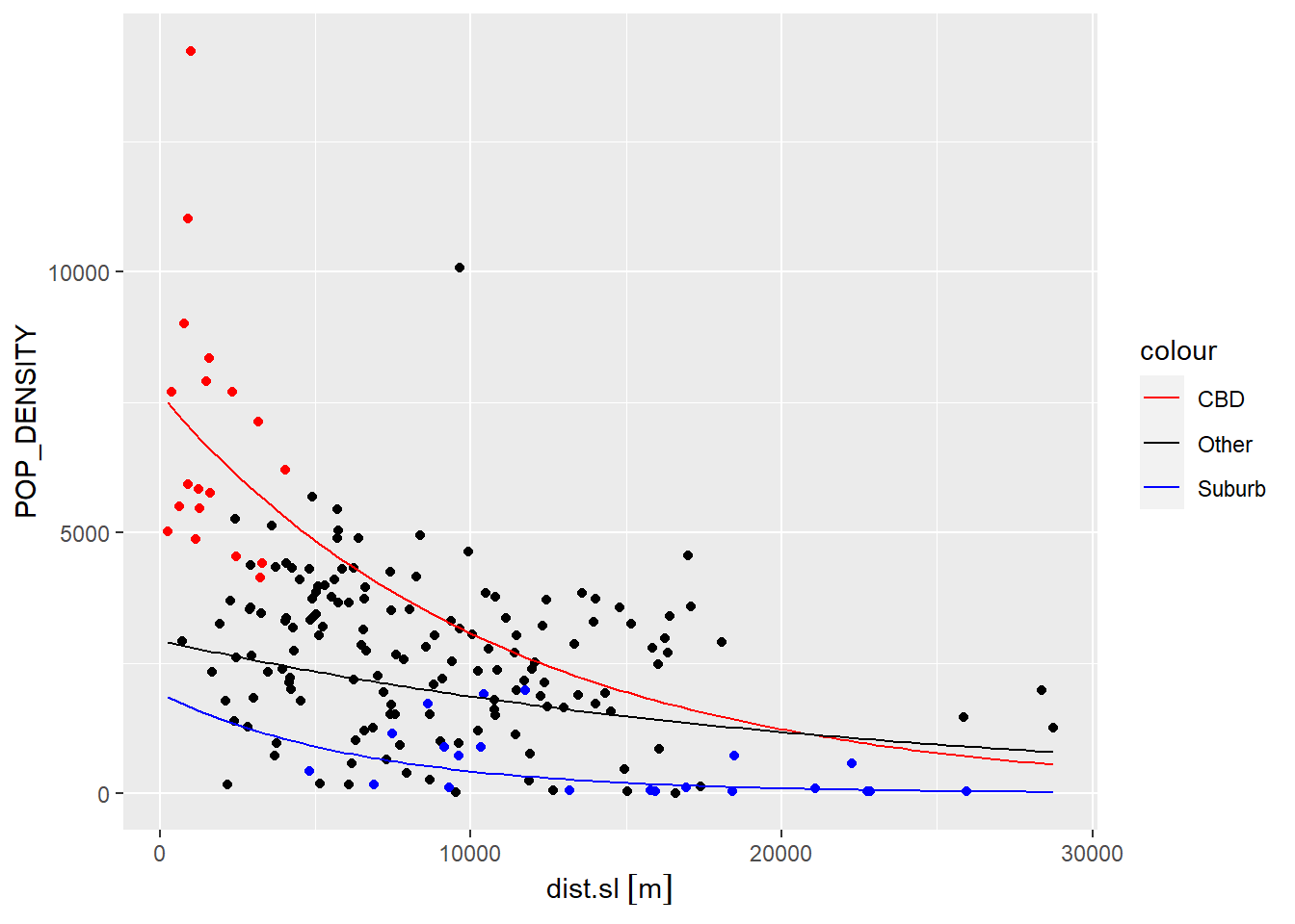
This example illustrate how spatial exploratory analysis can provide valuable insights to improve our models, and in turn hopefully develop a better understanding of the underlying process. What can you say about population density in Hamilton based on this model?