Chapter 25 Area Data IV
NOTE: The source files for this book are available with companion package {isdas}. The source files are in Rmarkdown format and packed as templates. These files allow you execute code within the notebook, so that you can work interactively with the notes.
25.1 Learning objectives
In the previous practice/session, you learned about the concept of spatial autocorrelation, and how it can be used to evaluate statistical maps when searching for patterns. We also introduced Moran’s \(I\) coefficient, one of the most widely used tools to measure spatial autocorrelation.
In this practice, you will learn about:
- Decomposing Moran’s \(I\).
- Local Moran’s \(I\) and mapping.
- A concentration approach for local analysis of spatial association.
- A short note on hypothesis testing.
- Detection of hot and cold spots.
25.2 Suggested readings
- Bailey TC and Gatrell AC (1995) Interactive Spatial Data Analysis, Chapter 7. Longman: Essex.
- Bivand RS, Pebesma E, and Gomez-Rubio V (2008) Applied Spatial Data Analysis with R, Chapter 9. Springer: New York.
- Brunsdon C and Comber L (2015) An Introduction to R for Spatial Analysis and Mapping, Chapter 7. Sage: Los Angeles.
- O’Sullivan D and Unwin D (2010) Geographic Information Analysis, 2nd Edition, Chapter 7. John Wiley & Sons: New Jersey.
25.3 Preliminaries
As usual, it is recommended that you begin your work with a new session of R. At the very least, make sure that the working space is clear from extraneous items there may have been there from earlier. The command in R to clear the workspace is rm (for “remove”), followed by a list of items to be removed. To clear the workspace from all objects, do the following:
Note that ls() lists all objects currently on the workspace.
Load the libraries you will use in this activity:
Load the datasets:
These two dataframes are simulated landscapes, one completely random and another stochastic with a strong systematic pattern. Note that the descriptive statistics of both variables are identical.:
##        x               y               z
##  Min.   : 1.00   Min.   : 1.00   Min.   :24.40
##  1st Qu.:27.00   1st Qu.:19.00   1st Qu.:27.89
##  Median :46.50   Median :33.00   Median :30.33
##  Mean   :45.61   Mean   :31.63   Mean   :34.38
##  3rd Qu.:66.00   3rd Qu.:45.00   3rd Qu.:38.25
## Max. :87.00 Max. :61.00 Max. :69.59## x y z
## Min. : 1.00 Min. : 1.00 Min. :24.40
## 1st Qu.:27.00 1st Qu.:19.00 1st Qu.:27.89
## Median :46.50 Median :33.00 Median :30.33
## Mean :45.61 Mean :31.63 Mean :34.38
## 3rd Qu.:66.00 3rd Qu.:45.00 3rd Qu.:38.25
## Max. :87.00 Max. :61.00 Max. :69.59The third dataset is an object of class sf (simple feature) with the census tracts of Hamilton CMA and some selected population variables from the 2011 Census of Canada:
25.4 Decomposing Moran’s \(I\)
Here we will revisit Moran’s \(I\) coefficient to see how its utility for the exploration of spatial patterns can be extended. Recall from the preceding reading and activity that this coefficient of spatial autocorrelation was derived based on the idea of aggregating the products of a (mean-centered) variable by its spatial moving average, and then dividing by the variance: \[ I = \frac{\sum_{i=1}^n{z_i\sum_{j=1}^n{w_{ij}^{st}z_j}}}{\sum_{i=1}^{n}{z_i^2}} \]
Also, remember that when plotting Moran’s scatterplot using moran.plot() some observations were highlighted. To see this, we will recreate the plot, for which we need a set of spatial weights:
And here is the scatterplot of population density again:
# We can use the arguments xlab and ylab in `moran.plot()` to change the labels for the two axes of the plot
mp <- moran.plot(Hamilton_CT$POP_DENSITY, Hamilton_CT.w, xlab = "Population Density", ylab = "Lagged Population Density")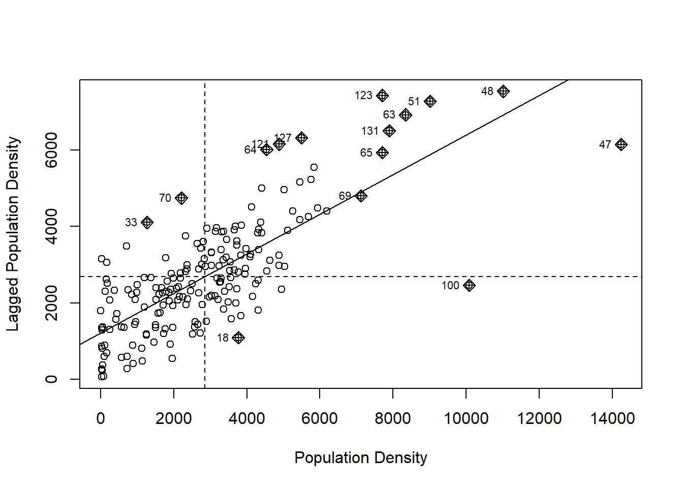
The reason some observations are highlighted is because they have been identified as “influential”, meaning that they make a particularly large contribution to the calculation of \(I\). It turns out that the relative contribution of each observation to the calculation of Moran’s \(I\) is informative in and of itself, and its analysis can provide more focused information about the spatial pattern.
To explore this, we will recreate the scatterplot manually to have better control of its aspect. To do this, we first create a dataframe with the mean-centered and scaled variable \(z_i=(x_i-\overline{x})/\sum z_i^2\), and its spatial moving average. We will also create a factor variable (call it Type) to identify the type of spatial relationship (Low & Low, if both \(z_i\) and its spatial moving average are negative, High & High, if both \(z_i\) and its spatial moving average are positive, and Low & High/High & Low otherwise). This is information is useful for mapping the results:
Hamilton_CT <- Hamilton_CT |> # Use the pipe operator to pass the dataframe as an argument to `mutate()`, which is used to create new variables.
  mutate(Z = (POP_DENSITY - mean(POP_DENSITY)) / var(POP_DENSITY), # Create a mean-centered variable that is standardized by the variance.
         SMA = lag.listw(Hamilton_CT.w, Z), # Calculate the spatial moving average of variable `Z`.
         # The function `case_when()` is used to evaluate several logical conditions and respond to them.
         Type = case_when(Z < 0 & SMA < 0 ~ "LL",
                          Z > 0 & SMA > 0 ~ "HH",
                          TRUE ~ "HL/LH"))
Next, we will create the scatterplot and a choropleth map of the population density. The package plotly is used to create interactive plots. Read more about how to visualize geospatial information with plotly here. The package crosstalk allows us to link two plots for brushing (brushing is a visualization technique that links several plots in a dynamic way to highlight some elements of interest).
To create an interactive plot for linking and brushing we first, create a SharedData object to link two plots:
The function bscols() (for bootstrap columns) is used to array two plotly objects; the first of these is a scatterplot, and the second is a choropleth map of population density.
bscols(
  # The first plot is Moran's scatterplot
  plot_ly(df_msc.sd) |> # Create a `plotly` object using the dataframe as an input. The pipe operator passes this object to the function `add_markers()`; this function is similar to the `geom_point()` function in `ggplot2` and it draws objects on the blank plot created by `plot_ly()`
    add_markers(x = ~Z, y = ~SMA, color = ~POP_DENSITY, size = ~(Z * SMA), colors = "YlOrRd") |>
    hide_colorbar() |>     # Remove the colorbar from the plot.
    highlight("plotly_selected"), # Highlight observations when selected.
  # The second plot is a choropleth map
  plot_ly(df_msc.sd) |> # Create a `plotly` object using the dataframe as an input. The pipe operator passes this object to the function `add_sf()`; this function is similar to the `geom_sf()` functions in `ggplot2` and it draws a simple features object on the blank plot created by `plot_ly()`
    add_sf(split = ~TRACT, color = ~POP_DENSITY, colors = "YlOrRd", showlegend = FALSE) |>
    hide_colorbar() |> # Remove colorbar from the plot.
    highlight(dynamic = TRUE) # Highlight observations when selected.
)
The darker colors are zones with higher population densities. The size of the dots in the scatterplot indicates the contributions of the zone to Moran’s \(I\). The darker colors in the choropleth map are higher population densities.Since the plots are linked for brushing, it is possible to selecting groups of dots in the scatterplot (double click to clear a selection). Change the color for brushing to select a different group of dots. Can you identify in the map the zones that most contribute to Moran’s \(I\)?
The direct relationship between the dots in the scatterplot and the values of the variable in the map suggest the following decomposition of Moran’s \(I\).
25.5 Local Moran’s \(I\) and Mapping
A possible decomposition of Moran’s \(I\) into local components is as follows (see Anselin 1995) (Available here): \[ I_i = \frac{z_i}{m_2}\sum_{j=1}^n{w_{ij}^{st}z_j} \] where \(z_i\) is a mean-centered variable, and: \[ m_2 = \sum_{i=1}^n{z_i^2} \] is its variance. \(I_i\) is called local Moran’s \(I\). It is straightforward to see that: \[ I = \sum_{i=1}^n{I_i} \]
In other words, the coefficients \(I_i\) when summed equal \(I\). To distinguish between these, we will call our Moran’s \(I\) coefficient a global statistic: there is one value for a map and it describes overall autocorrelation. \(I_i\), in turn, we will call a local statistic: it can be calculated locally for a location of interest, and describes autocorrelation for that location, as well as the contribution of that location to the global statistic.
An advantage of the local decomposition described here is that it allows an analyst to map the statistic to better understand the spatial pattern. The local version of Moran’s \(I\) is implemented in spdep as localmoran(), and can be called with a variable and a set of spatial weights as arguments:
The value (output) of the function is a matrix with local Moran’s \(I\) coefficients (i.e., \(I_i\)), and their corresponding expected values and variances (used for hypothesis testing; more on this next). You can check the summary to verify the contents:
##        Ii                E.Ii                Var.Ii              Z.Ii
##  Min.   :-0.62144   Min.   :-0.1506849   Min.   :0.000004   Min.   :-2.36042
##  1st Qu.: 0.00478   1st Qu.:-0.0054846   1st Qu.:0.012609   1st Qu.: 0.08777
##  Median : 0.12523   Median :-0.0017893   Median :0.048380   Median : 0.86588
##  Mean   : 0.51797   Mean   :-0.0053476   Mean   :0.169109   Mean   : 1.00476
##  3rd Qu.: 0.59384   3rd Qu.:-0.0004661   3rd Qu.:0.159707   3rd Qu.: 1.77619
##  Max.   : 8.30454   Max.   :-0.0000002   Max.   :4.708525   Max.   : 5.83338
##  Pr(z != E(Ii))
##  Min.   :0.00000
##  1st Qu.:0.07346
##  Median :0.31535
##  Mean   :0.36541
##  3rd Qu.:0.61867
##  Max.   :0.99755
Rename the columns for convenience:
Similar to the global version of Moran’s \(I\), hypothesis testing can be conducted by comparing the empirical statistic to its distribution under the null hypothesis of spatial independence. The function localmoran reports p-values to this end.
For further exploration, join the local statistics to the dataframe:
Hamilton_CT <- Hamilton_CT |>
  left_join(data.frame(TRACT = Hamilton_CT$TRACT,
                       POP_DENSITY.lm),
            by = "TRACT") # Join the results of `localmoran()` to the dataframe
Now it is possible to map the local statistics. Since we added the \(p\)-value of the local statistics, we can distinguish between those with small (say, less than 0.05) and large \(p\)-values:
# The function `add_sf()` draws a simple features object, similar to `geom_sf()` in `ggplot2`. We "split" observations based on their p-values: if the p-value is less than 0.05, the condition is "TRUE" and otherwise it is "FALSE". Finally, we color the zones based on their `Type`: that is, whether they are High & High according to the local statistic, or Low & Low, etc.
  plot_ly(Hamilton_CT) |>
    add_sf(type = "scatter",
           split = ~(p.val < 0.05),
           color = ~Type,
           colors = c("red",
                      "khaki1",
                      "dodgerblue",
                      "dodgerblue4"))
The map above shows whether population density in a zone is high, surrounded by other zones with high population densities (HH), or low, surrounded by zones that also have low population density (LL). Other zones have either low population densities and are surrounded by zones with high population density, or vice-versa (HL/LH).
Click on the legend to filter by category of TRUE-FALSE and HH-LL-HL/LH.
This map allows you to identify what we could call the downtown core (from the perspective of population density), and the most suburban-rural census tracts in the Hamilton CMA.
While mapping \(I_i\) or their corresponding \(p\)-values is straightforward, I personally find it more useful to map whether the zones are of type HH, LH, or HL/LH. Since such maps are not (to the best of my knowledge) the output of an existing function in an R package, so we will create one here.
# A function is a way of packaging a set of standard instructions. Here, we package all the steps we used above to create the map of the local Moran coefficients in a new function called `localmoran.map()`
localmoran.map <- function(p, listw, VAR, by){
  # p is a simple features object
  require(tidyverse)
  require(spdep)
  require(plotly)

  df_msc <- p |>
    rename(VAR = as.name(VAR),
              key = as.name(by)) |>
    transmute(key,
              VAR,
              Z = (VAR - mean(VAR)) / var(VAR),
              SMA = lag.listw(listw, Z),
              Type = case_when(Z < 0 & SMA < 0 ~ "LL",
                               Z > 0 & SMA > 0 ~ "HH",
                               TRUE ~ "HL/LH"))

  local_I <- localmoran(df_msc$VAR, listw)

  colnames(local_I) <- c("Ii", "E.Ii", "Var.Ii", "Z.Ii", "p.val")

  df_msc <- left_join(df_msc,
                      data.frame(key = df_msc$key,
                                 local_I),
                      by = "key")

  plot_ly(df_msc) |>
    add_sf(type = "scatter",
           split = ~(p.val < 0.05),
           color = ~Type,
           colors = c("red",
                      "khaki1",
                      "dodgerblue",
                      "dodgerblue4"))
}
Notice how this function simply replicates the steps that we followed earlier to create the map with the results of the local Moran coefficients.
To use this function you need as inputs an object of class sf, a listw object with spatial weights, and to define the variable of interest and a unique identifier for the areas (such as their tract identifiers). For example:
There, the function creates the map as desired.
25.6 A Quick Note on Functions
Once that you know the steps needed to complete a task, if the task needs to be repeated many times possibly using different inputs, a function is a way of packing those instructions in a convenient way. That is all.
25.7 A Concentration approach for Local Analysis of Spatial Association
The local version of Moran’s \(I\) is one of the most widely used tools of a family of measures called Local Statistics of Spatial Association or LISA. It is not the only one, however.
In this section, we will see an alternative way of exploring spatial patterns locally, by means of a concentration approach.
To introduce this new approach, imagine a landscape with a variable that can be measured in a ratio scale with a true zero point (say, population, income, a contaminant, or property values, variables that do not take negative values and the value of zero indicates complete absence).
Imagine that you stand at a given location on that landscape and survey your surroundings. If your surroundings look very similar to the location where you stand (i.e., if their elevation is similar, relative to the rest of the landscape), you would take that as evidence of a spatial pattern, at least locally. This is the fundamental idea behind spatial autocorrelation analysis.
As an alternative, imagine for instance that the variable of interest is, say, personal income. You might ask “how much of the regional wealth can be found in my neighborhood?” (or, if you prefer, imagine that the variable is a contaminant, and your question is, how much of it is around here?)
Imagine now that personal income is spatially random. What would you expect the share of the wealth to be in your neighborhood? Would that share change if you moved to any other location?
Lets elaborate this thought experiment. Take the df1 dataframe. The total sum of this variable in the region is 12,034.34. See:
## [1] 12034.34The following is an interactive plot of variable z in the sample dataframe df1. This variable is spatially random:
# Define how variables in the table are represented in the plot: for instance, the variable `x` corresponds to the x axis. Next, define the properties of the markers, or geometric objects in the plot. For example, their color will be proportional to variable `z`
plot_ly(df1_simulated,
        x = ~x,
        y = ~y,
        z = ~z,
        marker = list(color = ~z,
                      colorscale = c('#FFE1A1',
                                     '#683531'),
                      showscale = TRUE)) |>
  add_markers()
Imagine that you stand at coordinates x = 53 and y = 34 (we will call this location the focal point), and you survey the landscape within a radius \(r\) of 10 (units of distance) of this location. How much wealth is concentrated in the neighborhood of the focal point? Lets see:
# Define the focal point
xy0 <- c(53, 34)
# Select a radius
r <- 10
# Extract observations that are within a radius of `r` from focal point `xy0` (note that sqrt((x - xy0)^2 + (x - xy0)^2) is Pythagoras's formula for calculating the distance between two points; if this distance is less than `r`, the point is kept)
df1_simulated |>
  subset(sqrt((x - xy0[1])^2 + (y - xy0[2])^2) < r) |>
  select(z) |>
  sum()
## [1] 832.0156Here, we calculated how much of the variable is present locally around the focal point. Recall that the total of the variable for the region is 12,034.34.
If you change the radius r to a very large number, the concentration of the variable will simply become the total sum of the variable for the region. Essentially, the whole region is the “neighborhood” of the focal point. Try it.
Now, for a fixed radius, change the focal point, and see how much the concentration of the variable changes for its neighborhood. How does the concentration of the variable by focal point?
We will now repeat the thought experiment but now with the landscape shown in the following figure:
plot_ly(df2_simulated,
        x = ~x,
        y = ~y,
        z = ~z,
        marker = list(color = ~z,
                      colorscale = c('#FFE1A1',
                                     '#683531'),
                      showscale = TRUE)) |>
  add_markers()
Imagine that you stand at the focal point with coordinates x = 53 and y = 34. Can you identify the point in the plot? If you surveyed the neighborhood, what would be the concentration of wealth there? How would that change as you visited different focal points? Lets see (again, recall that the total of the variable for the whole region is 12,034.34):
xy0 <- c(53, 34)
# Select a radius
r <- 10
# Extract observations that are within a radius of `r` from focal point `xy0` (note that sqrt((x - xy0)^2 + (x - xy0)^2) is Pythagoras's formula for calculating the distance between two points; if this distance is less than `r`, the point is kept)
df2_simulated |>
  subset(sqrt((x - xy0[1])^2 + (y - xy0[2])^2) < r) |>
  select(z) |>
  sum()
## [1] 1316.884Change the focal point. How does the concentration of the variable change?
We are now ready to define the following measure of local concentration (see Getis and Ord, 1992): \[ G_i^*(d)=\frac{\sum_{j=1}^n{w_{ij}x_j}}{\sum_{i=i}^{n}x_{i}} \]
Notice that the spatial weights are not row-standardized, and in fact must be a binary variable as follows: \[ w_{ij}=\bigg\{\begin{array}{l l} 1\text{ if } d_{ij}\leq d\\ 0\text{ otherwise}\\ \end{array} \]
This is because in this measure of concentration, we do not calculate the spatial moving average for the neighborhood, but the total of the variable in the neighborhood.
A variant of this statistic removes from the sum the value of the variable at i: \[ G_i(d)=\frac{\sum_{j\neq i}^n{w_{ij}x_j}}{\sum_{i=i}^{n}x_{i}} \]
I do not find this definition to be particularly useful. I suspect it was defined to resemble Moran’s \(I\) where an area is not it’s own neighbor - which makes sense in an autocorrelation sense (an area is perfectly autocorrelated with itself). In a concentration approach, not using the value at \(i\) is less appealing.
As with the local version of Moran’s \(I\), it is possible to map the statistic to better understand the spatial pattern.
The \(G_i^*(d)\) and \(G_i(d)\) statistics are implemented in spdep as localG, and can be called with a variable and a set of spatial weights as arguments.
WE will calculate this statistic for the two datasets in the example above. This requires that we create binary spatial weights. Begin by creating neighbors by distance:
# Create a matrix of coordinates.
xy_coord <- cbind(df1_simulated$x, df1_simulated$y)
# Find all nearest neighbors that are withing 0 and 10 units of distance away from every observation.
dn10 <- dnearneigh(xy_coord, 0, 10)
There are two differences with the procedure that we used before to create spatial weights. First, when we created spatial weights for Moran’s \(I\) coefficient, we stated that an observation is not its own neighbor. For the concentration approach, we might prefer to say that an observation is in the neighborhood of interest (being at its center). For this reason, we might opt to include the observation at \(i\) (therefore include.self()). And secondly, the style of the matrix is now “B” (for binary):
# Convert the nearest neighbors `nb` object to spatial weights
wb10 <- nb2listw(include.self(dn10), style = "B")
The local statistics can be obtained as follows:
# The arguments of this function are a spatial variable and a list of spatial weights
df1.lg <- localG(df1_simulated$z, wb10)
The value (output) of the function is a ’vector localG object with normalized local statistics. Normalized means that the mean under the null hypothesis has been subtracted and the result has been divided by the variance under the null. Normalized statistics can be compared to the standard normal distribution for hypothesis testing. You can check the summary to verify the contents:
##    Min. 1st Qu.  Median    Mean 3rd Qu.    Max.
## -1.6345 -0.5085  0.1401  0.0657  0.5911  2.6638
The function localG() does not report the \(p\)-values, but they are relatively easy to calculate:
df1.lg <- as.numeric(df1.lg)
df1.lg <- data.frame(Gstar = df1.lg, p.val = 2 * pnorm(abs(df1.lg), lower.tail = FALSE))
How many of the \(p\)-values are less than the conventional decision cutoff of 0.05?
Now the second example:
##    Min. 1st Qu.  Median    Mean 3rd Qu.    Max.
## -4.2400 -2.6791 -1.3999  0.1503  2.3938 12.2401
Adding \(p\)-values:
df2.lg <- as.numeric(df2.lg)
df2.lg <- data.frame(Gstar = df2.lg, p.val = 2 * pnorm(abs(df2.lg), lower.tail = FALSE))
If we bind the results of the \(G_i^*(d)\) analysis to the dataframe, we can plot the results for further exploration. We will classify the results by their type, in this case high and low concentrations:
df2 <- cbind(df2_simulated[,1:3],df2.lg)
df2 <- df2 |>
  mutate(Type = case_when(Gstar < 0 & p.val <= 0.05 ~ "Low Concentration",
                          Gstar > 0 & p.val <= 0.05 ~ "High Concentration",
                          TRUE ~ "Not Signicant"))
And then the plot, but now color the points depending on whether they are high or low concentrations, and whether their \(p\)-values are lower than 0.05:
plot_ly(df2,
        x = ~x,
        y = ~y,
        z = ~z,
        color = ~Type,
        colors = c("red",
                   "blue",
                   "gray"),
        marker = list()) |>
  add_markers()
What kind of pattern do you observe?
25.8 A Short Note on Hypothesis Testing
Local tests as introduced above are affected by an issue called multiple testing. Typically, when attempting to assess the significance of a statistic, a level of significance is adopted (conventionally 0.05). When working with local statistics, we typically conduct many tests of hypothesis simultaneously (in the example above, one for each observation).
A risk when conducting a large number of tests is that some of them might appear significant purely by chance! The more tests we conduct, the more likely that at least a few of them will appear to be significant by chance. For instance, in the preceding example the variable in df1 was spatially random, and yet a few observations had p-values smaller than 0.05.
What this suggests is that some correction to the level of significance used is needed.
A crude rule to make this adjustment is called a Bonferroni correction. This correction is as follows: \[ \alpha_B = \frac{\alpha_{nominal}}{m} \] where \(\alpha_{nominal}\) is the nominal level of significance, \(\alpha_B\) is the adjusted level of significance, and \(m\) is the number of simultaneous tests. This correction requires that each test be evaluated at a lower level of significance \(\alpha_B\) in order to to achieve a nominal level of significance of 0.05.
If we apply this correction to the analysis above, we see that instead of 0.05, the p-value needed for significance is much lower:
## [1] 0.0001428571You can verify now that no observations in df1 show up as significant:
## [1] 0If we examine the variable in df2:
df2 <- mutate(df2,
              Type = case_when(Gstar < 0 & p.val <= alpha_B ~ "Low Concentration",
                               Gstar > 0 & p.val <= alpha_B ~ "High Concentration",
                               TRUE ~ "Not Signicant"),
              factor = Type)

plot_ly(df2,
        x = ~x,
        y = ~y,
        z = ~z,
        color = ~Type,
        colors = c("red",
                   "blue",
                   "gray"),
        marker = list()) |>
  add_markers()
You will see that fewer observations are significant, but it is still possible to detect two regions of high concentration, and two of low concentration.
The Bonferroni correction is known to be overly strict, and sharper approaches exist to correct for multiple testing. Between the nominal level of significance (no correction) and the level of significance with Bonferroni correction, it is still possible to assess the gravity of the issue of multiple comparisons. Observations that are flagged as significant with the Bonferroni correction, will also be significant under more refined corrections, so it provides the most conservative decision rule.
25.9 Detection of Hot and Cold Spots
As the examples above illustrate, local statistics can be very useful in detecting what might be termed “hot” and “cold” spots. A hot spot is a group of observations that are significantly high, whereas a cold spot is a group of observations that are significantly low.
There are many different applications where hot/cold spot detection is important.
For instance, in many studies of urban form, it is important to identify centers and subcenters - by population, by property values, by incidence of trips, and so on. In spatial criminology, detecting hot spots of crime can help with prevention and law enforcement efforts. In environmental studies, remediation efforts can be greatly assisted by identification of hot areas. In spatial epidemiology hot spots can indicate locations were a large number of cases of a disease have been observed. There are countless applications of this.
25.10 Other Resources
Check a cool app that illustrates the \(G_i^*\) statistic here